Introduction to Statistics and Geographic Data
Organizing Data and Assigning Format
 Example of raster data.
 The image is composed of cells, and each cell has a defined value.

The dimensions of data provide the framework for any database built into GIS. Before you construct or use your geodatabases, you must understand your field types/formats. Understanding of field types allows for correct establishment of relationships, easy calculations, and easy data display. This not only dictates how to organize your data into different groups, but also how to symbolize those groups once they are organized.
Data Sources
Metadata describe important attributes of data not included in data tables. Metadata describes the reference of the source of the data (where are your data from?!?!). It is advised that metadata should be provided within every shared geographic dataset to properly attribute the source of the data. Please use it! Did you collect the data? Did someone else? If so, give them credit! Metadata should describe who made the data, how it was made, when it was made, and what it was made to do. If it does not, then you need to do some research.
Spatial Data
Before you start working with data, it is good to ask a few questions to see if the data should be treated as spatial data. Are you going to use the location values in your analyses? Does the location of the data really matter? If you do use spatial data for analysis, consider the datum, projection, and units of the data! Remember that projection refers to transforming the coordinates (such as latitude and longitude) of one shape (such as a spheroid) to that of a different shape (such as UTM coordinates on a plane).
The spatial data can either be explicitly or implicitly spatial. Explicitly spatial data have defined spatial locations. Implicitly spatial data have spatial association, but it is not necessarily clearly defined.
Continuity of Spatial Data
Spatial data can either be discrete - existing in one defined interval - or continuous in space and time. Different types of GIS data have been created to accommodate for differences in spatial data continuity. Sometimes, it is appropriate to convert data between these types to ease analysis or comparison of other data. An important distinction to make in GIS data is vector versus raster formats. The ArcGIS help files do an excellent job at describing the continuity of spatial data.
Data Set
When dealing with data, you are generally examining a sample of a larger population of available information. A population is a census, which includes all of the possible things from which we can collect data. A sample is a subset of the population. We will discuss these terms in greater detail when we get to the sampling chapter.
Aggregating data
Aggregating data involves combining individual data points into area-wide data sets. In this text, we will learn how to properly aggregate and summarize data. However, it is worth noting that drawing conclusions on an individual based on aggregated data can result in an ecological fallacy, where the individual is misrepresented based on assumptions about a population.
In ArcGIS, when you cannot use binary data for statistical analysis of categorical counts, you need to aggregate data. To do so, use the Integrate Data tool (Data Management Tools, Feature Class Toolset) with the Collect Events tool (Spatial Statistics Tools, Utilities Toolset). The Integrate Data tool aligns topology within a specified threshold, while the Collect Events outputs a count of coincident data. These are good for analyses using the Hot Spot Analysis (Getis-Ord Gi*), Cluster and Outlier Analysis (Local Moran's I), and Spatial Autocorrelation (Morans I) tools. The Spatial Join tool (Analysis Tools, Overlay Toolset) can also aggregate data, where aggregation will occur if the Join One-to-One option is selected in the Join Operation box of the tool’s dialog. The Zonal Statistics as Table tool (Spatial Statistics Tools) gives summary statistics of rasters covered by different zones of polygons or rasters.
Variables
Understanding difference in how we quantify and describe values of data is very important. A common starting place in describing quantification is determining if the values of the data are discrete or continuous. While the concepts of discrete and continuous are somewhat analogous to vector and raster data, we will be speaking in more general terms – not just in reference to spatial data.
Description
Collectively exhaustive events are when every possible value fits into a category, and there is an appropriate field for each possible value. With mutually exclusive events, it’s not possible for a value to fit into multiple categories (fields). The categories (fields) of mutually exclusive events do not overlap – they would not fit in a Venn Diagram. Categories vs. Quantities in the Symbology Tab of the Layer Properties Dialog in ArcGIS10.2.
Data Sources
Metadata describe important attributes of data not included in data tables. Metadata describes the reference of the source of the data (where are your data from?!?!). It is advised that metadata should be provided within every shared geographic dataset to properly attribute the source of the data. Please use it! Did you collect the data? Did someone else? If so, give them credit! Metadata should describe who made the data, how it was made, when it was made, and what it was made to do. If it does not, then you need to do some research.
- Source data - Source data are from a primary source. The person using the data set is the one who collected it. Source data are the original data collected in the field by the analyst/cartographer.
- Archival data - Archival data are from a secondary source. The data are provided to or compiled by the analyst/cartographer. Archival data should always have a source citation!
Spatial Data
Before you start working with data, it is good to ask a few questions to see if the data should be treated as spatial data. Are you going to use the location values in your analyses? Does the location of the data really matter? If you do use spatial data for analysis, consider the datum, projection, and units of the data! Remember that projection refers to transforming the coordinates (such as latitude and longitude) of one shape (such as a spheroid) to that of a different shape (such as UTM coordinates on a plane).
The spatial data can either be explicitly or implicitly spatial. Explicitly spatial data have defined spatial locations. Implicitly spatial data have spatial association, but it is not necessarily clearly defined.
Continuity of Spatial Data
Spatial data can either be discrete - existing in one defined interval - or continuous in space and time. Different types of GIS data have been created to accommodate for differences in spatial data continuity. Sometimes, it is appropriate to convert data between these types to ease analysis or comparison of other data. An important distinction to make in GIS data is vector versus raster formats. The ArcGIS help files do an excellent job at describing the continuity of spatial data.
- Raster data - In GIS and photo editing software, rasters are represented by a series of adjacent cells or pixels. The user or the sampling precision usually defines the size of the pixels, which are generally square in shape. An excellent example is a digital photograph. If you zoom in close enough on a photograph, you can distinguish between individual pixels. Raster data are a continuous grid (array) of data covering an area. Continuous representation is not appropriate representation of all spatial data. Some data are not continuous over space. Imagery (i.e. photographs), elevation grids (DEM), and interpolated data are examples of raster data. Raster data can also represent discrete (discontinuous) data, mainly by contrast between cells, especially if some cells are allowed to represent null values. Because of their blocky, interconnected nature and to allow for advanced forms of analysis, rasters are often represented as matrices (multi-dimensional arrays).
- Point data - Point data represent discrete locations. They are generally in a vector format. Vector data are represented by points, lines, and polygons. Software such as ArcGIS, Autocad, and Adobe Illustrator are well suited to handling vector data. In GIS, vector data is most powerful when the vector file is associated with tabular data. An excellent example of point vector data are groundwater wells. Each well would be represented as a point on a map. The point will not become pixilated as you zoom in. Following the example, each well point could have a row in a table assigned to it that tells you the depth, water level, and diameter of the well.
- Polygon data - Polygon data can be an amalgamation of data. They are generally in a vector format. Polygons are often the result of aggregating data within defined boundaries. Polygon extents usually define the coverage of areas such as political or natural boundaries. Examples include census blocks, physiographic provinces, states, land masses and bodies of water. Polygons can overlap.
Data Set
When dealing with data, you are generally examining a sample of a larger population of available information. A population is a census, which includes all of the possible things from which we can collect data. A sample is a subset of the population. We will discuss these terms in greater detail when we get to the sampling chapter.
Aggregating data
Aggregating data involves combining individual data points into area-wide data sets. In this text, we will learn how to properly aggregate and summarize data. However, it is worth noting that drawing conclusions on an individual based on aggregated data can result in an ecological fallacy, where the individual is misrepresented based on assumptions about a population.
In ArcGIS, when you cannot use binary data for statistical analysis of categorical counts, you need to aggregate data. To do so, use the Integrate Data tool (Data Management Tools, Feature Class Toolset) with the Collect Events tool (Spatial Statistics Tools, Utilities Toolset). The Integrate Data tool aligns topology within a specified threshold, while the Collect Events outputs a count of coincident data. These are good for analyses using the Hot Spot Analysis (Getis-Ord Gi*), Cluster and Outlier Analysis (Local Moran's I), and Spatial Autocorrelation (Morans I) tools. The Spatial Join tool (Analysis Tools, Overlay Toolset) can also aggregate data, where aggregation will occur if the Join One-to-One option is selected in the Join Operation box of the tool’s dialog. The Zonal Statistics as Table tool (Spatial Statistics Tools) gives summary statistics of rasters covered by different zones of polygons or rasters.
Variables
Understanding difference in how we quantify and describe values of data is very important. A common starting place in describing quantification is determining if the values of the data are discrete or continuous. While the concepts of discrete and continuous are somewhat analogous to vector and raster data, we will be speaking in more general terms – not just in reference to spatial data.
- Discrete data are also known as thematic, categorical, or discontinuous data. There are restrictions (a finite quantity of values) on the values that the variable can assume. Discrete data are usually in an integers (short or long) and Boolean (true or false) field format, but can also be in a text format. A spatial example is a population counts for a region.
- Continuous values can vary anywhere amongst the real number line. These values can take on fractions or decimal values. Continuous data are typically in the double field format. The value for ϖ is a common example of a continuous value. Spatial examples of continuous data are stream discharge data and precipitation data.
Description
- Qualitative data can be observed but not measured and describe the qualities of the data. Qualitative data are generally represented as a “text” field in databases. Qualitative data have subjective qualities. An example of a qualitative attribute is color. Qualitative data are discrete and can be categorical. Spatial examples of qualitative data are land use type, county names, and geologic units.
- Quantitative data are objective quantities that have numeric values. Quantitative data can be continuous or discrete. Quantitative data usually are a “double” or “integer” type field in databases. Spatial examples of quantitative data include groundwater chemical concentrations and raster cell values.
Collectively exhaustive events are when every possible value fits into a category, and there is an appropriate field for each possible value. With mutually exclusive events, it’s not possible for a value to fit into multiple categories (fields). The categories (fields) of mutually exclusive events do not overlap – they would not fit in a Venn Diagram. Categories vs. Quantities in the Symbology Tab of the Layer Properties Dialog in ArcGIS10.2.
Classification of Variables - Scales
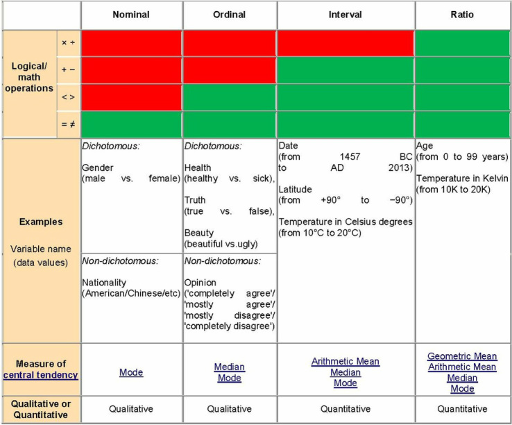
Psychologist Stanley Smith Stevens developed a set of levels (scales) of measurement. With each scale, the description becomes more quantitative and exact. Stevens delineated four scales – Nominal, Ordinal, Interval, and Ratio.
Some geographers, like Nicholas R. Chrisman, argue that these scales are not sufficient to cover measurement in geography. Chrisman’s scale includes 10 levels of measurement: (1) Nominal, (2) Graded membership, (3) Ordinal, (4) Interval, (5) Log-Interval, (6) Extensive Ratio, (7) Cyclical Ratio, (8) Derived Ratio, (9) Counts and finally (10) Absolute. While I urge you to examine Chrisman’s work, I will not include it here for the sake of brevity.
Classification with Software
Classification involves how best to group and classify your data. Classification of data involves determining where to draw the line between bins or groups of data (ie How many different shades of grey?). A classification break describes the split point for data into classes. ArcGIS and other software generally offer a way to classify data (in ArcGIS the Classification section in the symbology tab). The software allows you to choose the number of classes (groups) to split quantitative data, and allows you to pick the type of classification that you do.
There are many ways to classify data based on how breaks are defined. Manually defined breaks involve selecting break lines and moving them to where you want them. Equal interval classification divides value range into equally spaced subsets. In equal interval, changing the number of classes changes the interval. Quantile classification creates groups where each group contains the same number of features. An example of quantile classification is creating groups containing 50 yellow dots, 50 black dots, and 50 green dots. Natural breaks classification uses special algorithms to pick good breaks in data, known as jenks. Geometric interval classification balances equality in size of classes while also trying to distribute the values evenly. Geometric interval is good for continuous data and is a mix of equal interval, quantile, and natural breaks. Standard deviation classification shows the distribution of values above and below the average value, and will be discussed in more detail later.
A different way to classify data is through hierarchies. Hierarchies are subdivisions. An example is: We live in a neighborhood in a city in a county in a state in a country on a continent on a planet in a solar system in a galaxy. Another example of hierarchies are Hydrologic Unit Codes (HUCs), which are used to subdivide surface water drainage basins.
When classifying data, it is good to first understand how they are tabulated. In data tables, columns typically represent attributes, properties, or characteristics, while rows typically represent values, objects, or dependent variables. Classification can dramatically influence how data are displayed in tables. New columns can add layers of classification.
Aggregating Data
Aggregating data involves simplifying large amounts of data to make it easier to understand/visualize. This is one of the many applications of statistics. One must ensure that the type of aggregation used does not invalidate the data. Pivot tables in Excel and ArcGIS, and Crosstab Queries in Access are ways of aggregating large datasets.
Classifying data into groups of ranged values (bins) is also a good way to summarize data. Using counts of values for an area is an example of this (example: density maps). Grouped data can be good for true or false statements and qualitative data. You however must consider the distribution of the data when classifying into groups.
Database Structure
When classifying geographical data, you are often organizing your data into a geodatabase. You must consider the relationships you plan to establish, how you plan to use the data, and the information you want to retain. See if the data you are working with has a predefined database structure
Psychologist Stanley Smith Stevens developed a set of levels (scales) of measurement. With each scale, the description becomes more quantitative and exact. Stevens delineated four scales – Nominal, Ordinal, Interval, and Ratio.
Some geographers, like Nicholas R. Chrisman, argue that these scales are not sufficient to cover measurement in geography. Chrisman’s scale includes 10 levels of measurement: (1) Nominal, (2) Graded membership, (3) Ordinal, (4) Interval, (5) Log-Interval, (6) Extensive Ratio, (7) Cyclical Ratio, (8) Derived Ratio, (9) Counts and finally (10) Absolute. While I urge you to examine Chrisman’s work, I will not include it here for the sake of brevity.
- Nominal - The highest order of measurement scales. Nominal values are pretty much just names for things. They have no relative value and are separated only by qualitative differences. Examples include county names and geologic formations.
- Ordinal - The second level of measurement scales. Ordinal data are still qualitative, but they can be ordered. Examples include subjective sizes: small, medium, and, large. Ordinal data are more quantitative than nominal data and can be arranged as greater than and less than. Ordinal data can be arranged by rank order and the differences between ordinal data are relative. There are two strengths of order in ordinal data - weakly ordered data and strongly ordered data. Weakly ordered data denotes clusters of ranked data. An example of weakly ordered data is cities having between 5 to 10 septic systems per acre - one city may have a higher septic tank density than the other, but they are grouped together. Strongly ordered data denotes each value getting a ranked position. An example population by county - each population gets a different color along a scale based on its population. An example is ranking of places to live.
- Interval - Interval data use a relative scale and measure of the degree of difference between data. You cannot take the ratio between the data. An example of interval data is rating a movie from -5 to 5. Zeros are arbitrary in interval scale. The best term to think in for interval scale is numbers along a scale.
- Ratio - Ratio has a defined starting point and can exactly quantify the differences in measures. If you use ratios of ratio scales, the results are meaningful.
Classification with Software
Classification involves how best to group and classify your data. Classification of data involves determining where to draw the line between bins or groups of data (ie How many different shades of grey?). A classification break describes the split point for data into classes. ArcGIS and other software generally offer a way to classify data (in ArcGIS the Classification section in the symbology tab). The software allows you to choose the number of classes (groups) to split quantitative data, and allows you to pick the type of classification that you do.
There are many ways to classify data based on how breaks are defined. Manually defined breaks involve selecting break lines and moving them to where you want them. Equal interval classification divides value range into equally spaced subsets. In equal interval, changing the number of classes changes the interval. Quantile classification creates groups where each group contains the same number of features. An example of quantile classification is creating groups containing 50 yellow dots, 50 black dots, and 50 green dots. Natural breaks classification uses special algorithms to pick good breaks in data, known as jenks. Geometric interval classification balances equality in size of classes while also trying to distribute the values evenly. Geometric interval is good for continuous data and is a mix of equal interval, quantile, and natural breaks. Standard deviation classification shows the distribution of values above and below the average value, and will be discussed in more detail later.
A different way to classify data is through hierarchies. Hierarchies are subdivisions. An example is: We live in a neighborhood in a city in a county in a state in a country on a continent on a planet in a solar system in a galaxy. Another example of hierarchies are Hydrologic Unit Codes (HUCs), which are used to subdivide surface water drainage basins.
When classifying data, it is good to first understand how they are tabulated. In data tables, columns typically represent attributes, properties, or characteristics, while rows typically represent values, objects, or dependent variables. Classification can dramatically influence how data are displayed in tables. New columns can add layers of classification.
Aggregating Data
Aggregating data involves simplifying large amounts of data to make it easier to understand/visualize. This is one of the many applications of statistics. One must ensure that the type of aggregation used does not invalidate the data. Pivot tables in Excel and ArcGIS, and Crosstab Queries in Access are ways of aggregating large datasets.
Classifying data into groups of ranged values (bins) is also a good way to summarize data. Using counts of values for an area is an example of this (example: density maps). Grouped data can be good for true or false statements and qualitative data. You however must consider the distribution of the data when classifying into groups.
Database Structure
When classifying geographical data, you are often organizing your data into a geodatabase. You must consider the relationships you plan to establish, how you plan to use the data, and the information you want to retain. See if the data you are working with has a predefined database structure
